
Color Confidence: Mastering Your Palette
The Importance of Color Mastery
Color is one of the most powerful tools an artist has at their disposal. It sets the mood, creates harmony, and guides the viewer’s eye through a painting. Yet, mastering color can be intimidating—especially in oil painting, where mixing and layering colors requires both knowledge and practice. Developing confidence in your palette means understanding not only how colors interact but also how to create and control your own range of hues to express your unique artistic vision. This mastery transforms the act of mixing paint from guesswork into a creative, empowering process.
Understanding the Basics of Color Theory
Before diving into mixing, every artist benefits from a solid grasp of color theory. The color wheel is the foundation—a visual map of relationships between colors. Primary colors (red, yellow, blue) cannot be made by mixing others and serve as the building blocks for all other hues. Secondary colors (green, orange, purple) are created by mixing two primaries. Tertiary colors result from mixing primary and secondary colors.
Knowing these basics helps artists predict how colors will blend and interact. Complementary colors—those opposite each other on the wheel, like blue and orange—create strong contrasts and vibrant highlights when placed side by side. Analogous colors, found next to each other on the wheel, offer harmony and subtle transitions.
Beyond the wheel, understanding concepts like warm vs. cool colors and color value (lightness or darkness) helps artists create depth, mood, and focal points in their work.
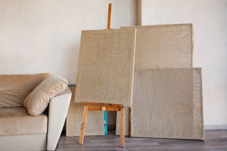
Building Your Palette: Limited vs. Expanded
A critical step in gaining color confidence is choosing your palette wisely. Beginners often feel overwhelmed by the number of paint tubes available, but a limited palette can actually boost creativity. Using fewer colors forces you to understand and experiment with mixing, rather than relying on premixed hues.
Many artists start with a basic limited palette consisting of a warm and cool version of each primary color (e.g., cadmium red and alizarin crimson for red; cadmium yellow and lemon yellow for yellow; ultramarine blue and phthalo blue for blue). This selection provides versatility while encouraging the artist to learn color mixing deeply.
An expanded palette adds more colors for convenience and specific effects, such as earth tones, specialized blues or greens, and various whites and blacks. Knowing when and how to introduce these colors without losing harmony is part of developing a confident palette.
Practical Techniques for Mixing Colors
Mixing paint is both a science and an art. To master your palette, it’s important to practice deliberate mixing rather than random blending. Start by learning how to create clean, vibrant secondary and tertiary colors. Avoid muddy colors by limiting the number of pigments mixed together and understanding the opacity and staining properties of your paints.
Keep a color mixing journal or chart. Record how primary colors mix to produce different hues and values. This practice sharpens your eye and memory for color relationships.
Another helpful technique is mixing on a palette rather than directly on the canvas. This gives you control over color purity and allows for consistency throughout the painting.
Managing Color Temperature and Harmony
Color temperature is a subtle but vital concept in creating mood and balance. Warm colors like reds, oranges, and yellows tend to advance toward the viewer, creating a sense of intimacy or energy. Cool colors such as blues, greens, and violets recede, providing calmness and space.
Mastering your palette includes the ability to shift colors warmer or cooler to achieve depth or highlight contrast. For example, warming a shadow color slightly can keep it lively, while cooling a highlight color can add atmosphere.
Color harmony is about selecting colors that work well together throughout the composition. This can be achieved through analogous palettes for soothing effects or complementary colors for bold, energetic contrasts.
Using Neutrals and Earth Tones Effectively
Neutrals and earth tones are often underestimated but play a crucial role in oil painting. They provide rest for the eye, unify compositions, and help to balance bright colors.
Creating neutrals by mixing complementary colors allows you to adjust the intensity and temperature, producing grays and browns that can subtly support your painting’s color story.
Incorporating earth tones like burnt sienna, raw umber, and yellow ochre adds natural warmth and texture. Knowing how to blend these with your palette colors can create realistic skin tones, landscapes, and muted backgrounds.
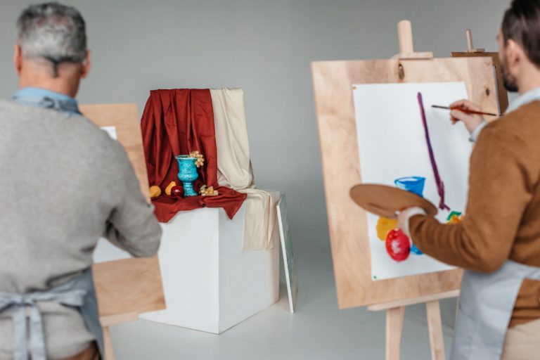
Practice and Experimentation: Keys to Confidence
Confidence with color grows through consistent practice and a willingness to experiment. Try creating small studies focused solely on color mixing and relationships. Experiment with glazing—applying transparent layers of color over dried paint—to see how light interacts with your palette.
Don’t be afraid of mistakes. Muddy or unexpected colors can become opportunities to learn. Over time, you’ll develop an intuitive sense of which colors to mix and how to modify them for the effect you want.